Peter Morville on Service Design
Written by Simon Clatworthy
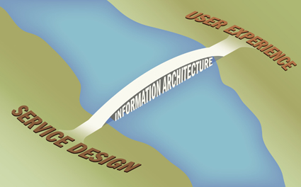
Peter Morville, him of the polar bear book on Information Architecture (link), and later Ambient Findability (link) has just written and interesting and informed piece about Ubiquitous Service Design (link). I’m always amazed about how compact and well linked his posts are, and this one is no exception. He introduces  a great many terms, but starts with Shostacks article about how to design a service from 1982 (link).  The blog entry skirts the differences between products and services before jumping deeply into service design in a period of ubiquitous computing. In one of his images, he suggests that information architecture builds a bridge between service design and user experience, and this is where his story breaks down for me.
I think he views services as information-based solutions, in which information has to be categorised, sorted and presented in specific forms (primarily on the web on a pc). That is fine for some services, but for a great many services this does not take account of the multiple touch-points that a service journey includes. The implication of this, is that the holistic experience is not just a matter of information architecture, but  also about behaviours, objects, interfaces and buildings – multiple touch-points. All of which have to work together to give a holistic experience that supports and strengthens the brand strategy of the company. I disagree with the implication from his diagram,  that user experience and service design are far apart. I think that what he really is drawing is the back-office/front office  divide, or line of service visibility, as Shostack calls it. In which case, there will be multiple bridges, each representing a touch-point (and only some of which are supported by information architecture).
But, the thing that caught my eye is further down in the blog post, his description of experience maps. Here he acknowledges the importance of visualisation as a means of eliciting innovations. He quotes from Dave Gray:
A picture can connect the strategic with the tactical in a way no other communication form possibly can
He presents an example of a book purchasing map, which doesn’t map the experience, but which opens up for exploring innovation possibilities through various ways of using the map. In other words, the map is a tool to elicit innovations, and one that does so in a different way from words.
This, to me, summarises much of Service Design, and the use of design as part of cross-functional teams. The designer not only has a role in terms of innovating/designing the customer experience, but also has an important role in terms of using visualisation as a tool, such that the team as a whole can innovate. Not only this, the designers ability to sketch out resulting ideas, adds a level of closure to an idea generation session. This gives the designer a triple role – innovator, facilitator, documenter, and underlines their importance in the team.
During the AT-ONE project, we have placed a lot of emphasis upon the designers multiple roles in the fuzzy front end of innovation. I think Peter has described this in a roundabout way, which puts him on a nice convergent tragectory with Service Design. It will be interesting to follow his journey.

