Government design guidelines
Written by Simon Clatworthy
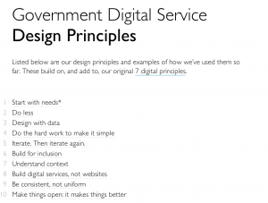
At gov.uk, you can find 10 simple yet effective design principles. These look like a great summary and summarise the most important things to think about when thinking digital services.
There are a lot of nice details in the choice of guidelines, and also in their wording (be consistent, not uniform for example). I particularly like number 8 – build digital services, not websites. This, for me could be number 1 on the list, because it has an overall importance. I talk more and more to government institutions that seem to be going into the same dead end as commercial companies did several years ago – focus upon one digital touch-point. Unless public sector services think customer journeys and orchestration of multiple touch-points, then we are going to get a whole load of websites for self service that will work reasonably, but quickly lose relevance and coherence. There is a danger that making a service digital can become a palliative rather than a cure. Taking number 8 seriously, has the potential to change this.
As we are now getting towards the end of the new year, then I think a new years resolution for all government service projects should be to do some customer journey mapping and touch-point optimisation. I hope that this resolution is one that actually happens.
