Extreme simplicity
Written by Simon Clatworthy
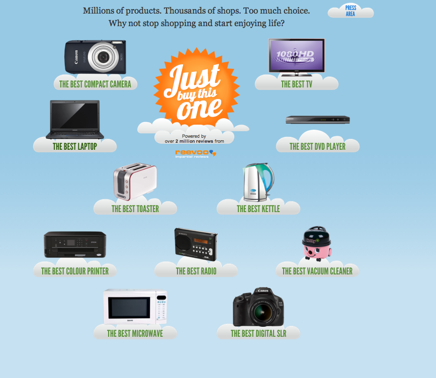
I came across this website (link) Â recently, and to me as a service designer, it has an instant appeal. It just offers one product as best in category, and thats it.
But, somewhere, is a nagging feeling that it is just too simple, and that things can’t be that easy. I don’t know if you share this feeling, but I think that as a concept, offering no choice  is perceived as a fantastic thing. “Oh, finally, not having to spend ages researching a product” (and studies show that people spend quite a lot of time on the net looking for recommendations before purchasing).  However, I think that they are confusing this initial positive reaction to the offering with the experience of choosing something through the site. When it comes to the experience, I believe that such extreme simplicity is a negatively perceived thing in todays society. Why?
When you refer to research on choice, there are two biases that often are mentioned. The first is a bias to go for the default option – following the herd. In that way, just buy this one, has everything in its favour. The second bias is that of relating a choice to something cheaper, to feel that you have bought quality over price. The site seems to score quite well there too, since it actually offers three options when you click on a category – a cheap one, an expensive one and one in the middle. Research says that people will like this. So, in many ways, they have done everything right. They have picked up on the fact that we negatively respond to too many choices, they use clever algorithms to pick the most popular choice and they bracket the options, to make you feel that you have chosen the right price-point.
So, why do I still feel that its just too easy?  My background as a service designer should applaud this, and in many ways, I think this is a really cool piece of service design. I just think that they have made the offering too easy and have missed out on one of the key elements of the experience society – our innate need to feel individual and unique.  Just like in the 1950’s, cake mixes were too simple, and manufacturers had to make them a bit more complex (by  getting people to add eggs and therefore let them feel they were adding part of themselves to the mix), I think they might need to pamper to the need people have to feel as individuals. So perhaps, this offering presents the idea that you as a customer have a simple need, and therefore are yourself somehow simple. My view is that customers like to feel like they are treated as individuals (as in the Monty Python sketch – you are all individuals – we are all individuals – Im not), even though they might in the end follow the majority of people. We spend a lot of time constructing our individual identities, and this site kinda says indirectly  that I am not in any way special.
What would I do about it? Well, I think that the offering is basically good – only one thing to relate to. However, I think I would change it slightly to be only one option based upon my individual needs. In other words, offer a very short process that allows people to quickly specify their needs, and then offer them three options, the best, and two bracketed alternatives. If they did this, then you would feel individual, special, pampered to, and that you really have simply found the best.
I might be over complicating this, and I am sure there are plenty of people who just want one choice. I just think it could be even better by offering some simple questions at first, to give some tailoring. That is after all, what massive data sets can help with. What do you think?
